
Bonfire OS 7.0
Bonfire OS is the built-in operating system for JMGO projectors. Previously called Luna OS, it was officially renamed Bonfire OS in mid-2022. The release of Bonfire 7.0 is designed to enhance the user experience of version 6.0.
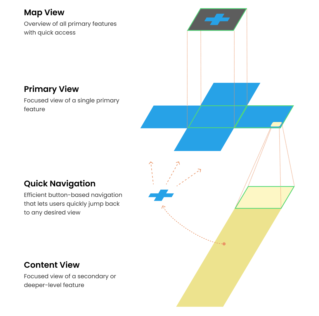
Overview
Timeline
2023/5 - 2023/10
My Role
UX designer
Responsibility
IA, User Flows, Wireframes, Prototypes, Usability Testing
Objective
Reorganize and strengthen the Bonfire OS product architecture, enhance system scalability, and address issues with user interaction and visual inconsistency.
Role & Deliverables
For this update, I worked with three product managers, three UI designers, and teams from development, user research, and operations. My main responsibilities included the information architecture, user flows, wireframes, user testing, and design system guidelines.
Challenges
The goal was to launch the new system with our new short-throw projector, requiring us to deliver the MVP within six months. With only one UX designer, prioritizing tasks and meeting deadlines was a major challenge.
Outcome
After the redesign, user engagement improved significantly — average monthly usage time increased by nearly 50%, app launch rate rose by 40%, and user satisfaction improved from 3.6 to 3.9.
Background

The 6.0 Spatial Version modified the previous version's information architecture and interaction interface. While it improved users' ability to explore various spaces, the depth of content in each space was insufficient to retain users, and the spatial structure made interactions difficult. Additionally, many functional modules were not included in the 6.0 update, leaving the Bonfire OS experience incomplete.
Problem
Why did we do this?
Depth of experience
In version 6.0, the depth of experience in each space was insufficient to retain users, with daily active user sessions lasting less than 10 minutes on average.
Usability
The five-layer spatial structure and the entry and exit interactions made the system difficult for users to navigate.
Scalability
Overly concrete, realistic, or skeuomorphic concepts limited the scalability of the experience and functionality, causing issues for long-term user engagement.

Goals & Challenges
Goal (MVP)
Reorganize and strengthen the Bonfire OS product architecture, enhance system scalability, and address usability and visual inconsistency issues.
Extend from spatial to first-person perspective; global navigation bar; simplified primary scene jumping.
Implement home interaction aligned with the directional pad on the remote control; establish relational interactions.
Visual consistency; design system
Challenges
1. The goal was to launch the new system with our new short-throw projector, requiring us to deliver the MVP within six months. With only one UX designer, prioritizing tasks and meeting deadlines was a major challenge.
2. In addition to optimizing the user experience of the system itself, we also need to consider the requirements coming from the hardware department to ensure a comprehensive product experience for new products and features.
Impact
To ensure the new version had a positive impact on users, I conducted user interviews in the early design phase to validate initial ideas, and usability testing in the later stages to refine the experience. The data confirmed that the redesign successfully increased user retention and engagement.
+51%
Average monthly usage time
+40%
App launch rate
+11%
OS User satisfaction
Progress
Design Sprints
We conducted three design sprints in total, working with the entire team to understand the issues, brainstorm various solutions, evaluate feasibility, and have users validate our ideas. The purpose of the design sprints was to quickly align the team with our goals and rapidly validate ideas in the early stages.

Design Principles
Here are the design principles defined by my team and me for the new version. These principles help us stay focused when facing challenges and making decisions.
Efficient
Provide users with the correct and important information at the right time and context, along with a clear interface, enabling them to efficiently achieve their goals.
Consistent
Enhance interface and interaction consistency to reduce user errors and improve the overall user experience.
Simple
Simplify navigation and information hierarchy, keeping interaction within seven steps per process to reduce cognitive load. Visually, eliminate unnecessary animations and explore light interactions and micro-interactions.
Early Design Concept
Key Initial Touchpoint — Design Concept: "Activate"
The Default Initial View plays a vital role in shaping the new experience of Bonfire OS. The focus must shift beyond product, interface, interaction, and motion design — toward building a meaningful and engaging relationship with our core users.
.png)
In our vision for an ideal BonfireOS experience, we aimed to fully leverage the efficiency of physical buttons while creating a more intuitive connection within the first- and second-level navigation. We also began exploring a cross-shaped primary navigation layout for improved directional control.
.png)
1 Default Initial View
It carries the crucial role of shaping atmosphere and communicating with users through key moments and timing.
2/3 The core and most-used feature
Group the most essential and frequently used features at the same interaction level to ensure quick and easy access for users.
4 Shortcut
A downward swipe reveals a customizable quick access panel, similar to the “minus one screen” on smartphones. It’s designed for frequently used apps or user-defined content, offering instant reach with minimal interaction.
5 Bonfire’s Signature Experience
Our goal is to create a thoughtfully designed entry point that offers users both a distinctive and optimized experience with our product.
Design (MVP)
New navigation mode: Cross interaction
Simplify main scene transitions and ensure seamless vertical transitions.

Compared to version 6.0, which required switching back and forth between five spaces, in the new version, we aim to reduce users' cognitive load and operational cost. Based on user behavior, we divided high-frequency functions into three main scenes: Home, Viewing, and Music. The Home scene includes the "Experience" section at the top and "Applications" at the bottom. To the left of the Home is "Music," and to the right is "Viewing." This way, users can access the most frequently used services on the same interaction layer.


💡 Why we chose this home page design
1. User Perspective: Imagine users turning on their home projector only to be greeted by a screen full of ads, with tools that can be better utilized on other devices. This would more likely prompt users to turn off the projector.
2. Highlighting Uniqueness: As we continue to develop, choosing to create an inviting atmosphere with a simpler initial screen enhances our innovative essence and uniqueness.
3. Design Challenges: Beyond creating an atmosphere, we need to consider factors such as understandability, convenience, usability, and commercialization. We aim to infuse passive atmosphere creation with valuable proactive behaviors in a fitting and clever manner.
This seemingly simple four-direction interaction posed challenges in the design process.
Challenge 1: Inconsistent Up and Down vs. Left and Right interactions
.gif)
Problem:
For the home page's up, down, left, and right interactions, we defined the top and bottom as part of the home page, allowing direct access to applications with the up or down buttons on the remote. However, the left and right sides were designated for Music and Movie, more purpose-driven scenes. To avoid accidental entries and high transition costs, pressing left or right required a secondary confirmation. However, in user testing, users did not understand the inconsistency in interactions.
Solution:
After identifying the issue, we made the up, down, left, and right interactions consistent and conducted longer user tests. Although users found the consistent interactions easier to understand, the likelihood of accidental entries increased. Therefore, based on our product positioning and error prevention principles, we decided to retain the original design.
Challenge 2: Muscle memory is not applicable in every scenario

Problem:
We defined that when users exit Music or Movie, pressing the back button highlights the home button, requiring OK or left/right keys to return home. However, in user testing, over half the users preferred pressing the back button twice to return home, believing it required less finger movement and better supported muscle memory.
Solution:
After the first user test, we changed the interaction to return to the home page with two presses of the back button. While more intuitive, we questioned if ease of use was most important when exiting an app. We identified two scenarios: "accidental activation" and "clear user intent." For "accidental activation," we provide more return paths. For "clear user intent," we avoid too many paths. Thus, we reverted to the original design.
Global Navigation Bar: Different Levels, Same Convenience

Definition
The global navigation bar helps users quickly switch between different applications and instantly access important and frequently used functions.
Value
Guidance: Provide timely direction when users feel lost or unsure of where to go.
Path Shortening: Help users reduce unnecessary actions and lengthy page transitions.
Access Records: Allow users to easily find recently used services and applications.

Primary Issues Addressed
Reducing Unnecessary User Actions: Minimize the number of steps and cognitive load involved in navigating and switching between applications.
Example
In OS 6.0, if a user is in a space or application other than the "Living Room," it requires six or more actions to find the desired application. Additionally, OS 6.0 lacks a "Recently Used" applications feature.

Bonchat: Lightweight AI interaction with proactive greetings and suggestions

Definition
Lightweight interactive experience with proactive greetings and cues, tailored to user preferences and context
Design Highlight

Right Moment
Smart recommendations driven by time, context, and behavioral insights — helping users take the right action at the right time.

Guidance Over Promtion
Using gentle, context-aware nudges instead of intrusive ads — encouraging user actions through subtle, seamless suggestions.

Emotional Activation
Even without a clear purpose, Bonchat’s gentle greeting offers users a sense of connection — a comforting reason to turn the device on.

From Tool to Companion
By enabling conversational interaction, users feel like they’re communicating with Bonfire OS — not just operating a device.
Key Scenarios

Launch / Re-entry
When users enter or return to the Home screen, a unique animation provides a sense of continuity.

Wake-up
Triggered when the device powers on or wakes from sleep, creating a welcoming moment.

Emotional Activation
Even without a clear purpose, Bonchat’s gentle greeting offers users a sense of connection — a comforting reason to turn the device on.

From Tool to Companion
By enabling conversational interaction, users feel like they’re communicating with Bonfire OS — not just operating a device.
Interactive Vista: The Light and shadow brought by the digital bonfire
Design concept for interactive Visia based on time framework
1. Time: Based on early user feedback about rhythm space and navigation, we revisited the essence of "all-time" companionship and decided to use "time" as the underlying framework of the system.
2. Light: The digital bonfire is a keyword closely tied to the projector's use scenario and is ownable. Thus, in our visual design, we used the "light" brought by the digital bonfire as another design element.
3. Design Principles: The extended design concept allows for visual changes and atmosphere creation that vary throughout the day.

Interaction design guidelines and definitions
In the past, multiple decision layers, team changes, and insufficient time to communicate content structure and interaction principles, along with agile development split into multiple workflows, led to a lack of the right people, experience, and mechanisms to integrate the system.
We believe clear interaction and visual guidelines help users understand the product, reduce anxiety, and increase enjoyment. For the team, these guidelines create a common language for product managers, designers, and engineers, reducing communication costs and development difficulties.
.png)


Reflection
1. Fulfill the foundational needs before pursuing innovation.
Throughout the 7.0 redesign process, we concentrated heavily on innovation, yet we neglected to enhance the fundamental user experience. Users prioritize aspects such as screen brightness, shape, and projector speed. Before advancing innovation, it is crucial to first address and improve these core functionalities..
2. Proactively engages stakeholders early in the process.
The redesign delay was mainly due to the team not involving stakeholders early and lacking consistent communication. This led to discovering a gap between stakeholder expectations and deliverables later in the project. We learned the importance of early stakeholder engagement and adjusting communication frequency to align on project goals and progress.
3. User-centered design is not simply about following user opinions.
User testing often reveals differences between user feedback and our design intentions. This doesn't mean users are always right or our design is wrong. It’s crucial to align the product’s positioning with user needs and anticipate aspects users may overlook.
Next Step
1. Post-launch optimization
The most important part of every product launch or redesign is what comes next. We rely on post-launch feedback and behavioral data to continuously refine the experience and deliver greater value to our users.
2. From experience to impact: Evaluating business value
This redesign focused on enhancing the user experience and creating an immersive atmosphere. However, whether these design improvements can translate into tangible business value is the key question we need to explore next.